Introduction
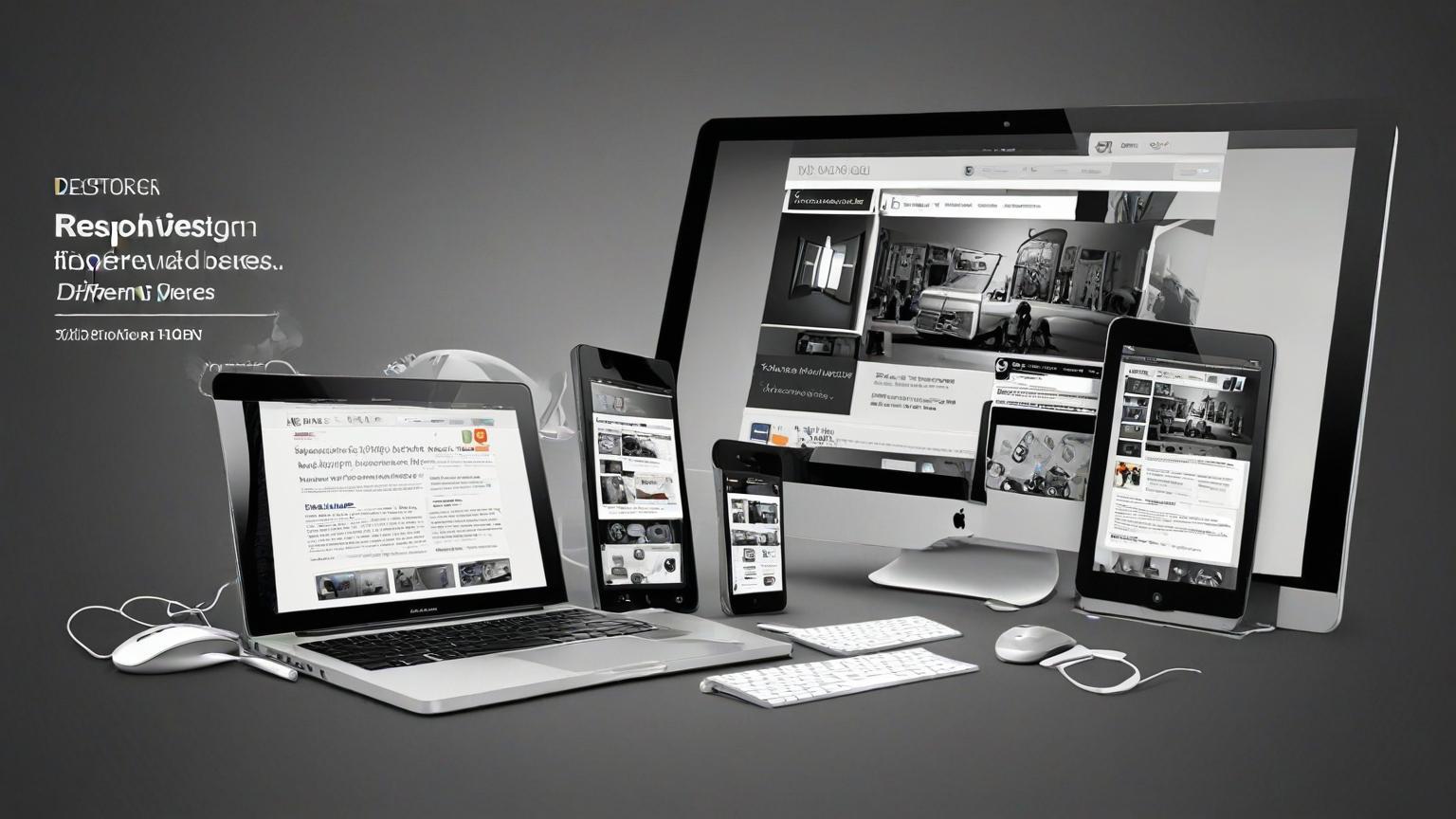
Responsive web design (RWD) is a crucial approach in modern web development, enabling websites
to adapt to different devices and screen sizes. As more users access the internet via smartphones,
tablets, and other devices, ensuring a consistent and user-friendly experience across all platforms is
essential. This guide delves into the principles of responsive web design, practical techniques, and
best practices for creating adaptive websites.
Introduction to Responsive Web Design
Responsive web design is an approach that allows web pages to render well on various devices and
window or screen sizes. It ensures that the user experience and interface remain consistent
regardless of the device used to access the website. This adaptability is achieved through flexible
grids, layouts, images, and CSS media queries.
Key Principles of Responsive Web Design
Fluid Grids
Fluid grids are the foundation of responsive design, using relative units like percentages instead of
fixed units like pixels.
1. Proportional Layouts: Use percentages to define the widths of elements, ensuring they
resize proportionally to the screen size.
2. Flexible Containers: Design containers that adjust their size based on the viewport,
providing a consistent layout across devices.
Flexible Images
Images in responsive design need to scale and adjust to different screen sizes without losing quality
or causing layout issues.1. Responsive Images: Use CSS to set images to a maximum width of 100% to ensure they
scale within their containing element.
2. Picture Element: Use the HTML5 <picture> element and srcset attribute to serve different
image resolutions based on the device's screen size.
CSS Media Queries
Media queries are a key component of responsive design, allowing styles to be applied based on
the characteristics of the device.
1. Viewport Width: Use media queries to apply different styles based on the width of the
viewport.
@media (max-width: 768px) {
/* Styles for screens smaller than 768px */
}
2. Orientation: Apply styles based on the orientation of the device (landscape or portrait).
@media (orientation: landscape) {
/* Styles for landscape orientation */
}
Practical Techniques for Responsive Web Design
Mobile-First Design
Start designing for the smallest screens first and gradually add more features and layouts for larger
screens.
1. Prioritize Content: Identify the most important content and features for mobile users and
design around them.
2. Progressive Enhancement: Add more complex layouts and features for larger screens
through media queries.
Responsive Typography
Ensure that text is legible and aesthetically pleasing on all devices by using responsive typography
techniques.
1. Relative Units: Use relative units like ems or rems instead of pixels to allow text to scale
based on the user's settings.
css
Copy code
body {font-size: 1rem; /* 1rem equals the root element's font size */
}
2. Fluid Typography: Implement fluid typography that adjusts the font size based on the
viewport width.
h1 {
font-size: calc(1.5rem + 2vw); /* Combines rems and viewport width */
}
``#### Media Queries for Typography**: Adjust font sizes and line heights for different screen sizes using
media queries. ```css
@media (max-width: 600px) {
body {
font-size: 0.9rem;
}
}
Flexible Navigation
Design navigation menus that adapt to different screen sizes while remaining user-friendly.
1. Hamburger Menus: Use a hamburger menu for smaller screens to save space and simplify
navigation.
<div class="menu-toggle">
<span></span>
<span></span>
<span></span>
</div>
2. Dropdowns and Collapsibles: Implement dropdown or collapsible menus for smaller
screens to maintain accessibility and usability.
Responsive Forms
Design forms that are easy to use on all devices, ensuring that form fields and buttons are
appropriately sized and spaced.
1. Fluid Form Fields: Use relative units and flexible layouts to ensure form fields adjust to
different screen sizes.input, textarea {
width: 100%;
padding: 0.5rem;
}
2. Touch-Friendly Elements: Ensure buttons and touch targets are large enough to be easily
tapped on small screens.
Tools for Responsive Web Design
Bootstrap
Features: A popular front-end framework that includes responsive grid systems, pre-
designed components, and utilities.
Use Case: Ideal for quickly building responsive websites with a consistent design.
Foundation
Features: A responsive front-end framework that provides a flexible grid system, UI
components, and templates.
Use Case: Suitable for creating robust and responsive websites with customizable
components.
CSS Grid Layout
Features: A CSS layout system that allows for the creation of complex and responsive grid-
based layouts.
Use Case: Perfect for designing intricate layouts that need to adapt to different screen sizes.
Media Queries
Features: CSS3 feature that allows the application of styles based on device characteristics
like width, height, and orientation.
Use Case: Essential for implementing responsive design techniques and ensuring content
adapts to various devices.
Real-World Case Studies
Starbucks
1. Overview: Starbucks implemented responsive web design to ensure a consistent and user
friendly experience across devices.
2. Design Elements: Flexible grids, responsive images, and media queries to adapt layouts and
typography.
3. Impact: Enhanced user experience and increased engagement on mobile devices.
Dropbox
1. Overview: Dropbox redesigned its website with a mobile-first approach to improve
accessibility and usability on all devices.
2. Design Elements: Simplified navigation, responsive forms, and adaptive images.
3. Impact: Improved user satisfaction and higher conversion rates on mobile platforms.BBC News
1. Overview: BBC News adopted responsive web design to provide a seamless reading
experience across different devices.
2. Design Elements: Fluid grids, responsive typography, and flexible navigation menus.
3. Impact: Increased mobile traffic and user engagement, ensuring accessibility to a wider
audience.
Best Practices for Responsive Web Design
Test on Multiple Devices
Ensure that your website works well on various devices and screen sizes by testing on actual
devices and using emulators.
1. Device Testing: Test the website on smartphones, tablets, laptops, and desktops.
2. Emulators and Simulators: Use tools like BrowserStack or Responsinator to simulate
different devices and screen sizes.
Optimize for Performance
Responsive websites should load quickly on all devices, especially on slower mobile networks.
1. Image Optimization: Compress images and use appropriate formats to reduce load times.
2. Lazy Loading: Implement lazy loading for images and other media to improve performance.
<img src="image.jpg" loading="lazy" alt="description">
Maintain Accessibility
Ensure that your responsive design is accessible to all users, including those with disabilities.
1. Contrast and Readability: Use sufficient contrast and readable fonts to ensure text is legible.
2. Keyboard Navigation: Ensure that the website can be navigated using a keyboard, and that
interactive elements are focusable.
3. ARIA Labels: Use ARIA (Accessible Rich Internet Applications) labels to provide additional
context to assistive technologies.
<button aria-label="Close menu">X</button>


 by Aqib Chaudhary