Office Address
A5, AEHS, Lahore, Pakistan
Phone Number
+92 306 77 57 681
A5, AEHS, Lahore, Pakistan
+92 306 77 57 681


 by Aqib Chaudhary
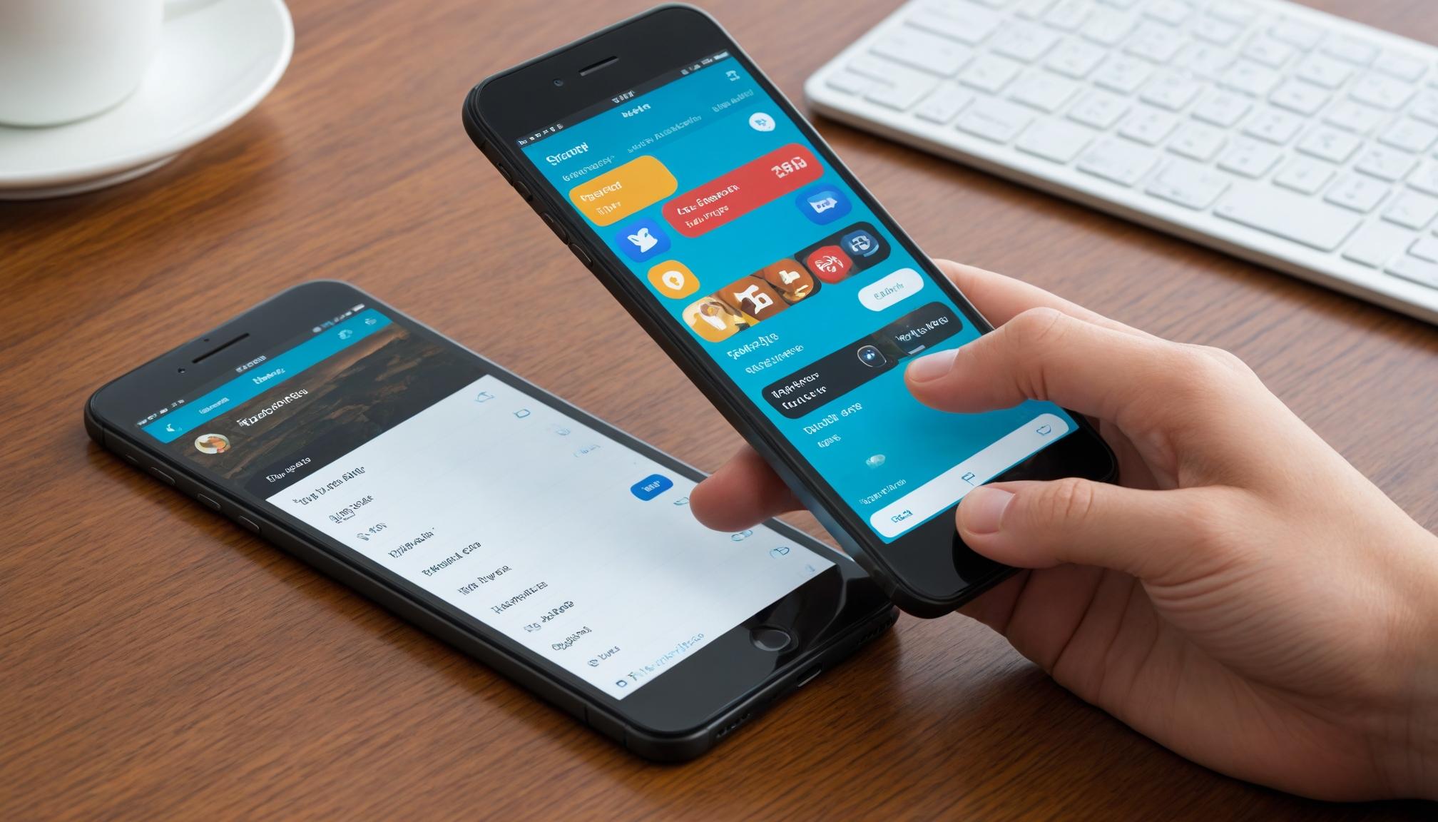
In the rapidly evolving mobile landscape, designing apps that perform flawlessly on different devices is crucial. This guide will cover key concepts including responsive design, adaptive layouts, and best practices in handling various screen sizes and resolutions.
Mobile devices come in a wide array of screen sizes and resolutions, from small smartphones to large tablets. Designing an app that looks great on all these devices requires careful planning and execution.
Responsive design uses CSS media queries to adjust the layout based on the screen size, while adaptive design has multiple fixed layout sizes. When the device's screen size is detected, the layout closest to the screen's size is selected.
There are several tools and frameworks available that can aid in designing for multiple devices: