Data visualization is a powerful tool for interpreting and presenting data insights in a clear and engaging manner. It allows decision-makers to quickly grasp complex information and identify trends, patterns, and outliers. This guide will delve into the key techniques, tools, and best practices for creating effective data visualizations.
Introduction to Data Visualization
Data visualization is the graphical representation of data and information. It uses visual elements like charts, graphs, and maps to make data accessible and understandable. Effective data visualization is crucial for data analysis, helping to communicate findings and support decision-making processes.
Key Data Visualization Techniques
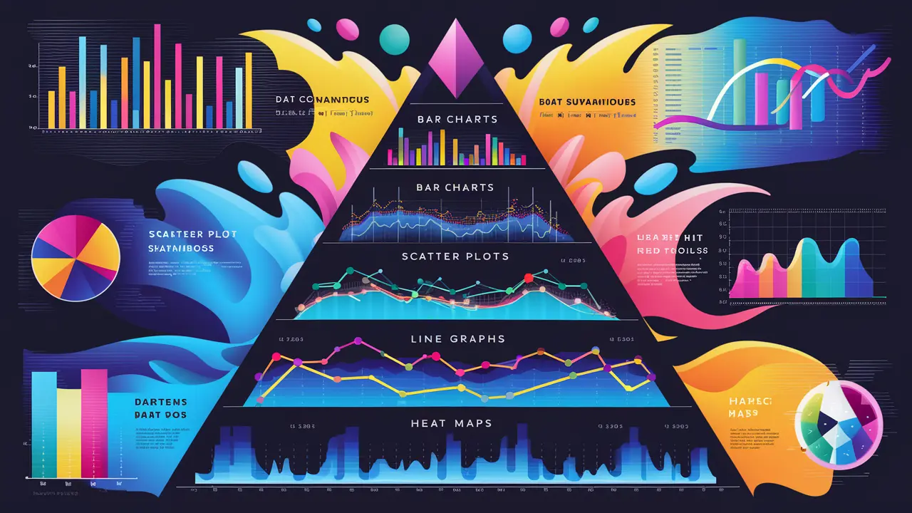
Types of Data Visualizations
- Bar Charts
- Line Charts
- Pie Charts
- Scatter Plots
- Histograms
- Heat Maps
- Box Plots
- Bubble Charts
- Use Case: Compare quantities across different categories.
- Best Practices: Use consistent colors, arrange bars in descending order, and label axes clearly.
- Use Case: Display trends over time.
- Best Practices: Use different colors or line styles for multiple data series, ensure the time axis is evenly spaced, and avoid clutter.
- Use Case: Show proportions of a whole.
- Best Practices: Limit the number of slices to improve readability, use contrasting colors, and avoid using pie charts for data with small differences.
- Use Case: Show the relationship between two variables.
- Best Practices: Use a clear title, label axes, and consider adding trend lines or regression lines.
- Use Case: Display the distribution of a dataset.
- Best Practices: Use appropriate bin sizes, ensure the x-axis represents the data range accurately, and label axes.
- Use Case: Show data density or variations across a geographical area or a matrix.
- Best Practices: Use a gradient color scale, provide a legend, and avoid using too many colors.
- Use Case: Display the distribution and variability of a dataset.
- Best Practices: Label the quartiles, outliers, and whiskers, and use consistent colors.
- Use Case: Show the relationship between three variables.
- Best Practices: Use different bubble sizes to represent the third variable, label axes, and ensure bubbles are not overlapping excessively.
Visual Storytelling
- Context: Provide background information to help the audience understand the data.
- Focus: Highlight the most important data points and trends.
- Simplicity: Avoid clutter and keep the visualization simple and clear.
- Engagement: Use interactive elements to engage the audience and allow them to explore the data.
Tools for Data Visualization
Microsoft Power BI
- Features: User-friendly interface, integration with various data sources, customizable dashboards, and real-time data updates.
- Use Case: Suitable for business intelligence and creating interactive reports and dashboards.
Tableau
- Features: Drag-and-drop interface, powerful analytics capabilities, extensive library of visualizations, and integration with numerous data sources.
- Use Case: Ideal for complex data analysis and creating detailed and interactive visualizations.
Google Data Studio
- Features: Free tool, seamless integration with Google services, customizable reports, and collaborative features.
- Use Case: Great for creating reports and dashboards that need to be shared and collaborated on.
D3.js
- Features: Highly customizable, supports complex visualizations, and leverages web standards (HTML, SVG, CSS).
- Use Case: Best for developers looking to create custom, web-based data visualizations.
Plotly
- Features: Interactive visualizations, support for various chart types, and integration with Python, R, and JavaScript.
- Use Case: Suitable for creating interactive and publication-quality graphs.
Matplotlib and Seaborn (Python Libraries)
- Features: Extensive customization options, built-in statistical plots (Seaborn), and integration with other Python data science libraries.
- Use Case: Ideal for detailed and highly customized visualizations in data analysis workflows.
Infogram
- Features: Easy-to-use interface, pre-designed templates, interactive charts, and infographics.
- Use Case: Perfect for creating quick and visually appealing infographics and reports.
Best Practices for Data Visualization
Understand Your Audience
- Know Their Needs: Tailor the visualization to the audience's knowledge level and what they need to know.
- Focus on Key Insights: Highlight the most important information that the audience needs to understand.
Choose the Right Visualization
- Match the Data Type: Select the visualization that best represents the data (e.g., use line charts for trends, bar charts for comparisons).
- Avoid Misleading Visuals: Ensure that the visualization accurately represents the data without distortion.
Design for Clarity
- Simplify: Remove unnecessary elements and focus on the data.
- Label Clearly: Use clear and concise labels for axes, titles, and data points.
- Use Consistent Colors: Apply a consistent color scheme to avoid confusion.
Incorporate Interactivity
- Tooltips: Provide additional information through tooltips when hovering over data points.
- Filters and Controls: Allow users to filter data and control the view to explore different aspects of the data.
Test and Iterate
- Feedback: Gather feedback from users to understand how they interpret the visualization.
- Refinement: Continuously refine the visualization based on feedback and testing.
Real-World Case Studies
Business Intelligence Dashboard
- Company Overview: A global retail company uses Power BI to create an interactive dashboard that tracks sales performance, inventory levels, and customer demographics.
- Impact: The dashboard allows executives to make data-driven decisions, identify trends, and optimize inventory management.
Healthcare Analytics
- Project Overview: A healthcare provider uses Tableau to analyze patient data, monitor treatment outcomes, and identify areas for improvement in patient care.
- Impact: Improved patient outcomes through data-driven insights, better resource allocation, and enhanced treatment plans.
Marketing Campaign Analysis
- Project Overview: A digital marketing agency uses Google Data Studio to create reports that track the performance of marketing campaigns, including metrics such as click-through rates, conversions, and ROI.
- Impact: The agency can quickly assess the effectiveness of campaigns, adjust strategies, and demonstrate value to clients.
Future Directions in Data Visualization
AI and Machine Learning Integration
- Automated Insights: AI-powered tools can automatically generate insights and highlight key trends from data.
- Predictive Visualizations: Integrating machine learning models with visualization tools to create predictive analytics dashboards.
Enhanced Interactivity
- Augmented Reality (AR): Using AR to visualize data in a 3D space, providing a more immersive experience.
- Virtual Reality (VR): Leveraging VR to explore complex datasets in a virtual environment.
Collaboration and Sharing
- Real-Time Collaboration: Tools that allow multiple users to collaborate on data visualizations in real time.
- Social Sharing: Enhanced features for sharing visualizations on social media platforms and embedding them in websites.


 by Aqib Chaudhary